How To Write Accessible Content With Yoast

By Prebuilt Sites Team
December 6, 2021
EDITOR’S NOTE: Making sure that your website’s content is accessible is extremely important. Not only is it actually legally required by the ADA, it gives everyone (including those that are visually or hearing impaired) the chance to read your article. But how do you make sure that your content is accessible? Yoast SEO has a few tools that can help! First you want to make sure that you’re including descriptive alt text in your images and contrasting colors across your site for those that may have a tougher time with eyesight. Include captions in your videos to help those that are hearing impaired understand what’s going on. Keep your sentences short and concise so that anyone at any reading level can easily understand your message. If you have any questions about website compliance, reach out to us at Prebuilt Sites or The BBS Agency and we’d love to help!
Having an accessible website means that more people can use your website and the information that you share. There are a couple of checks you can do yourself before publishing an article to make sure your article can be read and understood by as many people as possible. Did you know Yoast SEO and the block editor, the default content editor in WordPress, have built-in tools that can warn you about common mistakes and help you test your content? Here’s a list of four things that you can easily check!
Writing accessible content is about making sure that your content can be accessed and understood by all your website’s visitors, including people with visual or hearing impairments and people who are scrolling your content in a hurry. Of course, that’s reason enough to improve the accessibility of your website. But search engines, such as Google, also stress the importance of the accessibility of your site, as you can read in this post.
We have built Yoast SEO to help you optimize and structure your content and improve readability. The tools in the plugin help you write accessible content, while you are working on improving your website’s SEO. Moreover, the WordPress block editor allows you to do some quick checks to make sure you don’t accidentally exclude visitors from enjoying your content. Let’s dive in.
You can find a more technical post about accessibility tips over in our Dev Blog, if you’d prefer to read that!
1. Add text alternatives for media
You should always have a text alternative to important media files including images, video and audio. Without text alternatives, search engines and visitors with visual or hearing impairments may have problems understanding the content of your page.
How to test if your images are accessible
You should first check if your content has images of text that you can remove and replace with plain text. Images of text have several disadvantages that make them less accessible compared to plain text. You can not use browser settings to resize or change the color of the text or image backgrounds. So people with sight problems, color blindness or visual disturbance might have difficulty seeing it. Images also increase the loading time of your page. Both the Web Content Accessibility Guidelines and Google advise against using images of text.
Next, you want to make sure that all images have an alternative text (AKA alt tags). Yoast SEO analysis will warn you if there are images that are missing alt texts, and if the image is missing the keyphrase in these too.
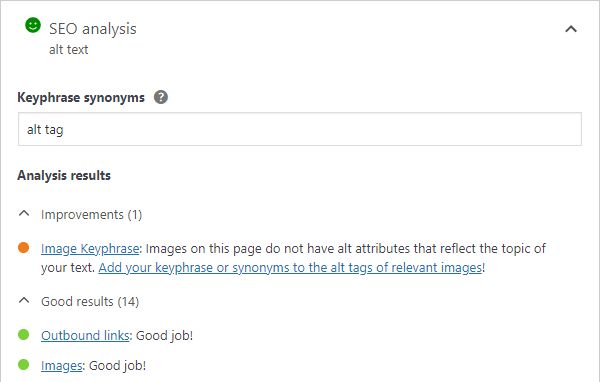
Photo: Yoast
The alternative text describes the purpose of the image. How long an alternative text should be can depend on your language, but the recommendation is to use less than 125 words.
When an alt text is not enough
Sometimes, you need more than an alt text to describe an image. When you are showing complex charts or maps, describe the data and the result in your main text as a complement to the image. Avoid repeated and redundant information in the alt text.
Read more: Image SEO: How to optimize your alt text and title text »
Use captions and descriptions for video and audio accessibility
If you have a video presentation of your product, you want it to be available to as many people as possible. Captions will help people who have hearing impairments better understand what is in the video. Don’t only rely on automated captions, because they are often incorrect.
If the video displays essential information that the narrator does not explain, or if the video has no sound, then a description is needed for people with visual impairments.
How to upload captions for videos
Once you have prepared a video caption file you can add it to your video directly in the video block.
- First, add a video block and select your video.
- Next, select the option in the block toolbar called Text tracks.
Selecting this option lets you upload the file or select it from the media library:
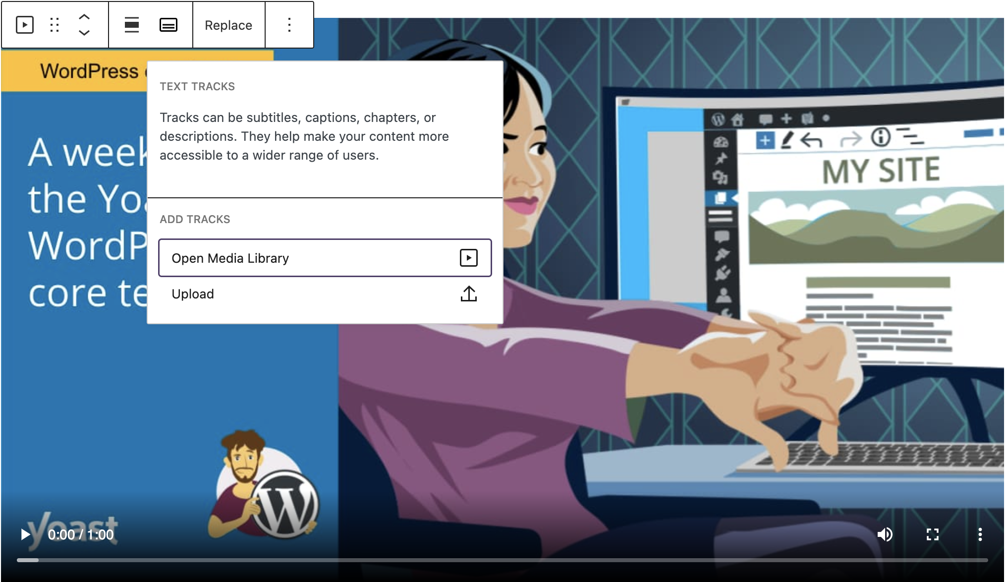
Photo: Yoast
Keep reading: How to add captions to your videos »
2. Make your text easy to read
Do you ever quickly scan a webpage and then find that you have to go back and read a paragraph again to understand it? You can make your text easier to read by following the advice from the Yoast SEO readability analysis.
Using short sentences and descriptive headings makes your text easier to read for people who are in a hurry. But did you know that it can also make it easier for people who have hearing impairments? For some people who are deaf, reading a text means interpreting it in a second language, because their first language is sign language.
If you want your text to be accessible for everyone, you will want to keep the Flesch reading ease score high, and avoid using complex words. Sometimes when you’re talking about a certain topic, it’s hard to keep your text simple. Try your best — if you can make your text easier to read, it will be accessible to more people.
Read on: The Flesch reading ease score: why and how to use it »
3. Find and correct problems with headings
A screen reader is a program that helps users by reading out loud what is on a screen. People with visual impairments can use screen readers both on computers and cellphones to make text more accessible. Screen readers can also be useful for people with reading disabilities.
Users with screen readers can navigate your web page using headings to locate the content they find interesting. Because of that, headings should describe the content below and should not be used only to add styling like bold or larger text size.
Tips for using headings for accessibility
- Headings have six different levels that indicate the importance of your content.
- You should only use the H1 heading once on your page, and most of the time, this will be your page title.
- The H1 should be followed by an H2; the H2 should be followed by an H3, and so on.
- You can use more than one H2 heading (or lower) if you have multiple sections of the same importance.
How to test if the heading order is correct
You can use the document outline feature in the block editor to see if your headings are in the correct order. You can open the document outline from the Details option by clicking the information icon in the toolbar above the editor:
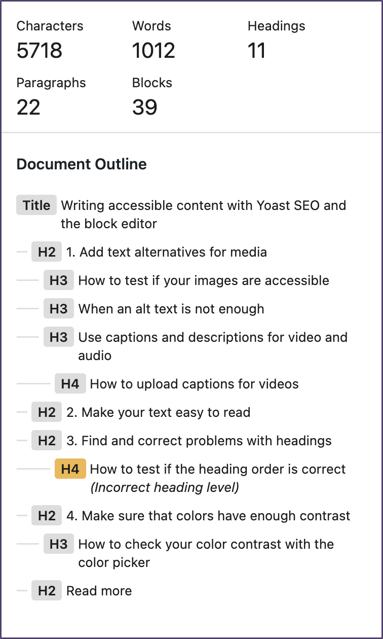
Photo: Yoast
If your page has headings in the wrong order, the document outline will mark them with a yellow background and the text: Incorrect heading level. Clicking on the heading in the document outline will select the heading block so that you can update it.
Keep on reading: SEO basics How to use headings on your site »
4. Make sure that colors have enough contrast
You can strengthen your brand by using your brand colors across your website. But some color combinations can have an impact on accessibility. You may already know that if someone is color blind, it can be difficult to see the difference between red and purple and green. So avoid using red and green alone for error messages or alerts.
If you add a text with a light color over a light background, the text can be difficult to read and even more difficult if the text is small.
With the block editor color picker, you can check if your background color and text color have a high enough contrast to be accessible.
How to check your color contrast with the color picker
- Select the text-based block that you want to test.
- Open the color panel in the block setting sidebar.
If the color contrast is too low, you will see a warning that says “This color combination may be hard for people to read”.
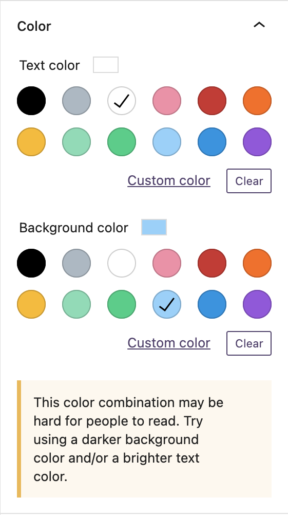
Photo: Yoast
Conclusion
Making minor changes to your content can positively impact your website’s accessibility, and it does not need to be complicated. SEO and accessibility go hand in hand; when you improve one, you most likely improve both. You may have read the phrase “search engines are blind”, but you should always write for people first.
Originally posted on Yoast.

