
5 Web Design Trends That Began In 2021

By Prebuilt Sites Team
January 12, 2022
EDITOR’S NOTE: Web design has been shifting a lot in recent years, but we saw greater shifts in 2020 and 2021 than we have in years past. The first big change we saw was using softer color palettes. Before the pandemic, brands used a lot of loud colors meant to grab your attention. Now softer palettes that are more calming and reassuring tend to have more success. We saw unique imagery come to the surface and the ability to let the user decide whether they want to play a video or not. Many brands started putting more effort into their e-commerce stores as physical stores closed, and we don’t think this trend is going away. Keep reading to learn more web design trends that surfaced in 2021, and how they can help you moving into 2022. If you have any questions about website design or want us to take care of it for you, reach out to us at Prebuilt Sites or The BBS Agency. We’d love to help you out!
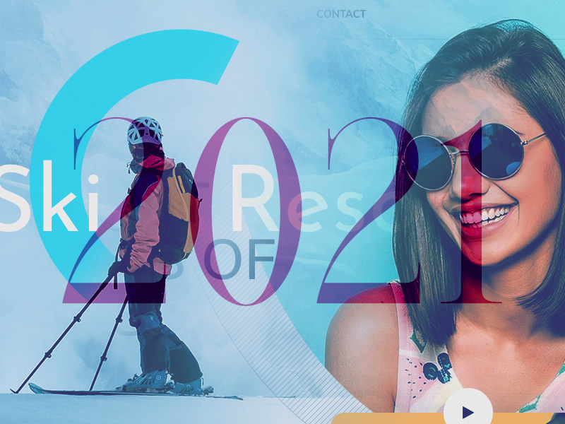
Photo: Web Design Ledger
Given all the drama, panic and fear that dominated 2020, we are seeing brands tone down their usage of color in 2021. Businesses, their customers, and the population as a whole have had to make adjustments. And may have to make even more as we prepare for what will be the new normal, whatever that new normal will look like. This applies to web designers as well.
While design trends may tend to change with time, some are more or less evergreen. If they change at all, the change is slow, while newer ones may suddenly be thrust upon us.
None of the following 5 new design trends for 2021 should cause a web designer any grief. They are not radical, mind-bending conceptions. They make sense, they are not difficult to implement, and they even suggest that the new normal may be an improvement over the old one.
We’ll show you examples of websites that are already incorporating some of these new trends, together with a selection of BeTheme pre-built websites that are also onboard.
- Use soothing and reassuring color palettes
Strong, bold color palettes along with a variety of gradient schemes have been emphasized in recent design trends to capture a visitor’s attention.
We’ve tired of the stress, strain, and shouting associated with 2020’s “normal”, and we are more than ready to change to calmer times, and softer and more toned-down color palettes as well.
The Bellroy company’s website is an excellent example of a toned-down look. You can in fact almost smell the leather in its line of practical everyday products.
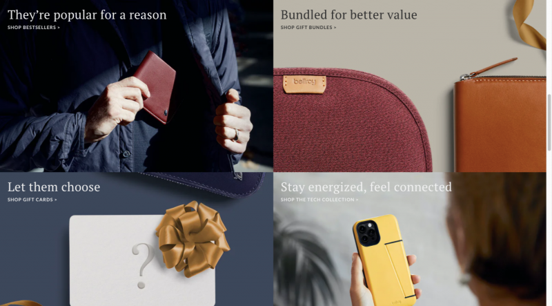
Photo: Web Design Ledger
Note the toned-down background’s effect on the brightly colored object. The object still stands out, as it should do, but without shouting for your attention.
The BeSpa pre-built website’s color scheme offers another example of sending a message that is calm, inspiring, and above all, doesn’t shout to get attention.
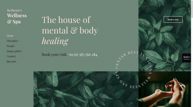
Photo: Web Design Ledger
This calm and comfortable imagery invokes pleasant, live in the moment feelings; feelings of well-being and security, and feelings that invite a visitor to explore further.
- Effortlessly blend physical and digital imagery
Many, including numbers of new remote workers, were stuck at home with not much to do but look at their screens in 2020. This led to a greater blending of their physical lives with the digital world.
Taking note of this change in scenery, some web designers began blending graphics and special effects with real-world images, as is the case with the fashion designer Constance Burke website:
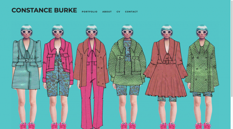
Photo: Web Design Ledger
Note the blending of real models with hand drawn sketches of real products.
The BeSki pre-built site also blends the real with the digital, but takes a vastly different approach in doing so:
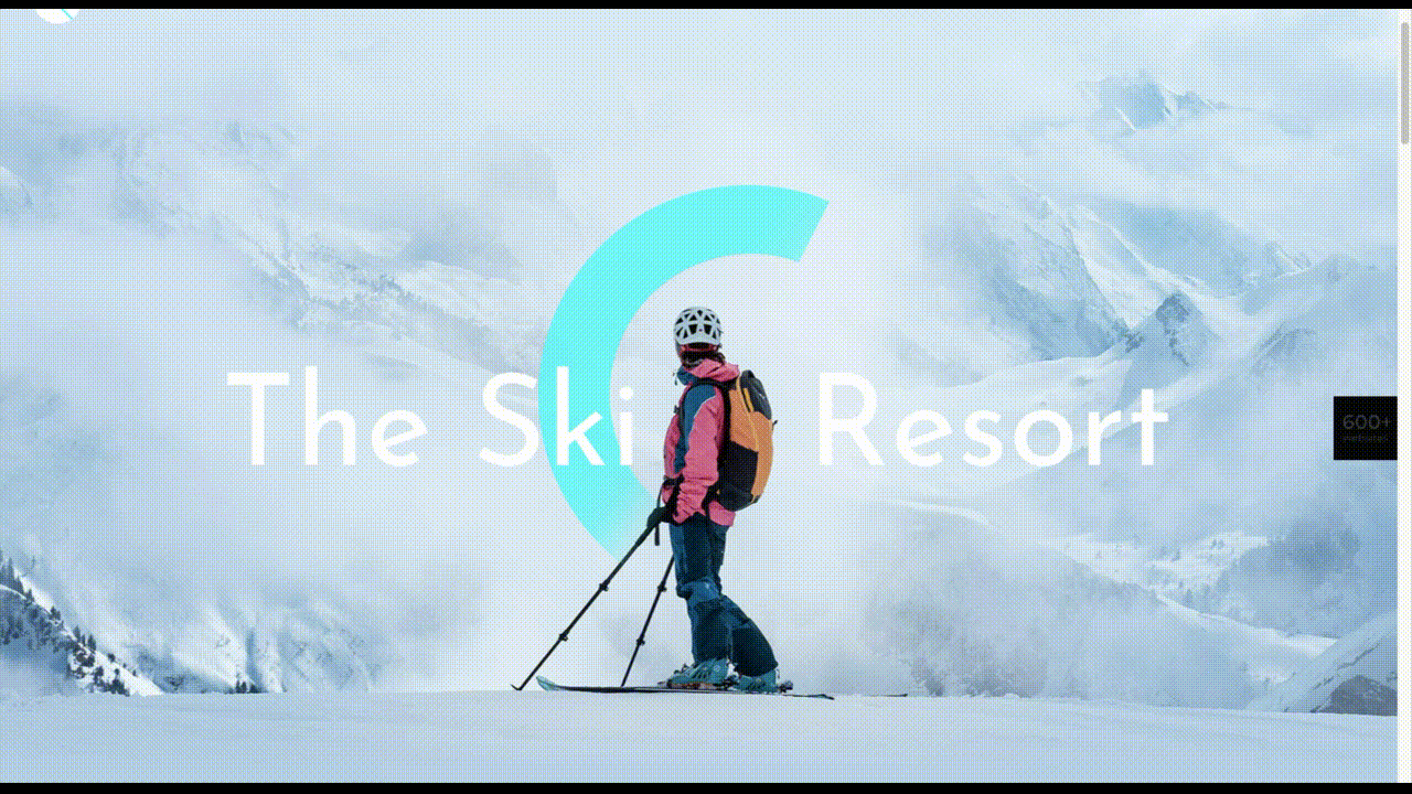
Photo: Web Design Ledger
Note how the snow in the hero section with its real image on the homepage blends in with the next section with its digital image, which in turn blends back into a real image section, and so on.
- Create friendly and more efficient online shopping experiences
In 2020 we witnessed a boom in online shopping, a trend that is likely to continue and accelerate. With more people shopping online than ever before, ecommerce sites need to present visitors with pathways to conversions that are efficient and easy to follow.
When they are in a brick and mortar store and know what they want, shoppers want to get in and out as quickly as possible. If they are not sure of exactly what they want or are just looking, they still want assistance or suggestions to help them make comparisons or selections.
Walgreens’ product page design sets a good example for what shoppers would like to see in an eCommerce website design in 2021:
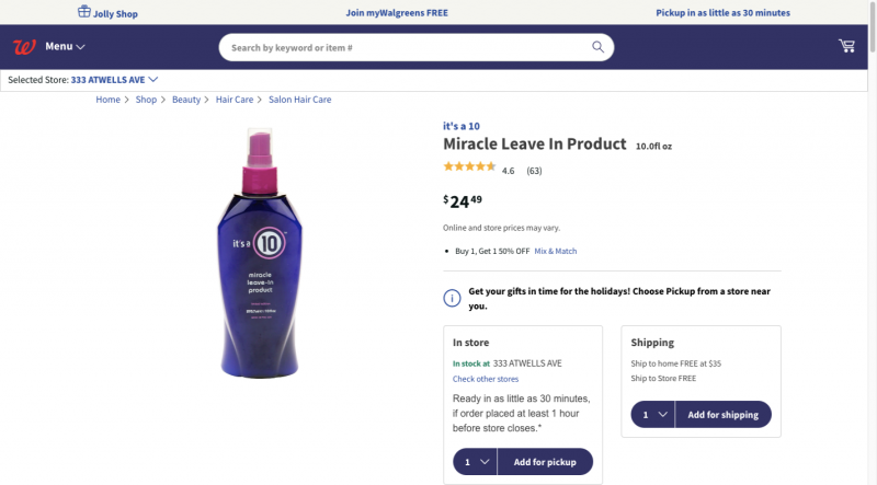
Photo: Web Design Ledger
Everything a prospective buyer needs to know is up front, and other useful information such as special offers, discounts, and customer ratings are above the fold. In the event a purchase is to be made, the next steps are clearly presented.
BePestControl’s pre-built site uses a similar method:
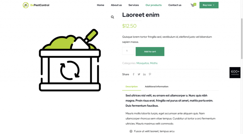
Photo: Web Design Ledger
In this example, a shopper can either place a selection directly in the cart or read the additional information beneath the button before doing so. BePestControl highlights the importance of using straightforward navigation aids to make shopping a more satisfying experience in 2021.
- Emphasize user-controlled video content
Once upon a time video on websites was the greatest thing since warm bread, and it is still an important vehicle for providing informative content. But are today’s users thrilled with it? Not quite so much.
Most users only want to view a video if they feel the need to see it. In other words, user-controlled videos are in, and embedded autoplay videos are becoming more and more unpopular. If viewers are given the choice as to whether to view or not to view, you can expect video to make a substantial comeback this year.
This is how Payoneer has dealt with the issue:
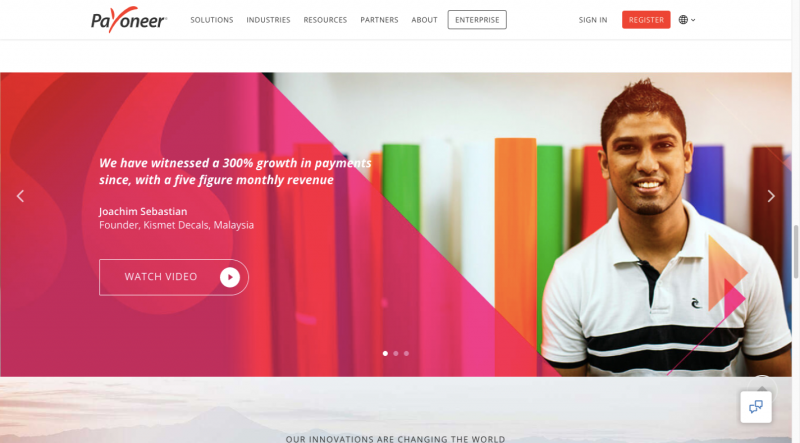
Photo: Web Design Ledger
Notice how the Watch Video button stands out against the background. Although it invites and even entices a visitor to view the video, he or she is not forced to do so. Either way, the visitor will appreciate having been given the option.
The BeOptics pre-built site uses an analogous, albeit a slightly more subtle approach:
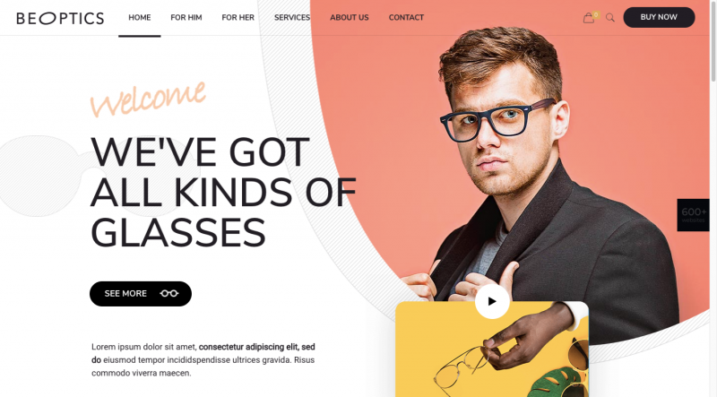
Photo: Web Design Ledger
Here, the See More botton acts as a gateway to more information and makes visitors aware that they have an opportunity to learn more instead of compelling them to do so as would be the case with an autovideo.
- Spend more time showing off trust builders
Although trust builders are indispensable elements in web design, finding the right ones can be a challenge. Instead of spending several minutes to size up a brick and mortar business, an online shopper will often do so in a minute or less.
Fortunately, the following trust building approaches are familiar to web designers, and they can make use of any one or of several:
- Data visualization (e.g., charts, graphs, counters, statistic callouts)
- Logos, whether they are a client’s, a partner’s, or media’s
- Client or customer reviews and/or testimonials
- Case studies/portfolios
- Security seals (e.g., Better Business Bureau (BBB), TRUSTe, PayPal Checkout)
- Proof of social involvement, environmental involvement, etc.
It’s simply a matter of which of these would be a good fit to a business’s website and could convince a visitor to become a valued customer.
The approach taken by Omaze is to emphasize social involvement, encourage its visitors to make donations, and offer prizes when they do so.
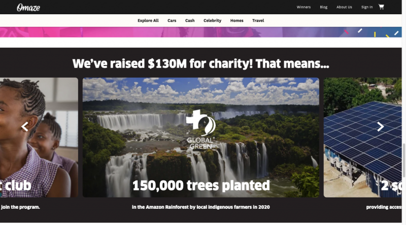
Photo: Web Design Ledger
It also brings added legitimacy to the table by reserving a space for highlighting reputable publications that have featured the organization.
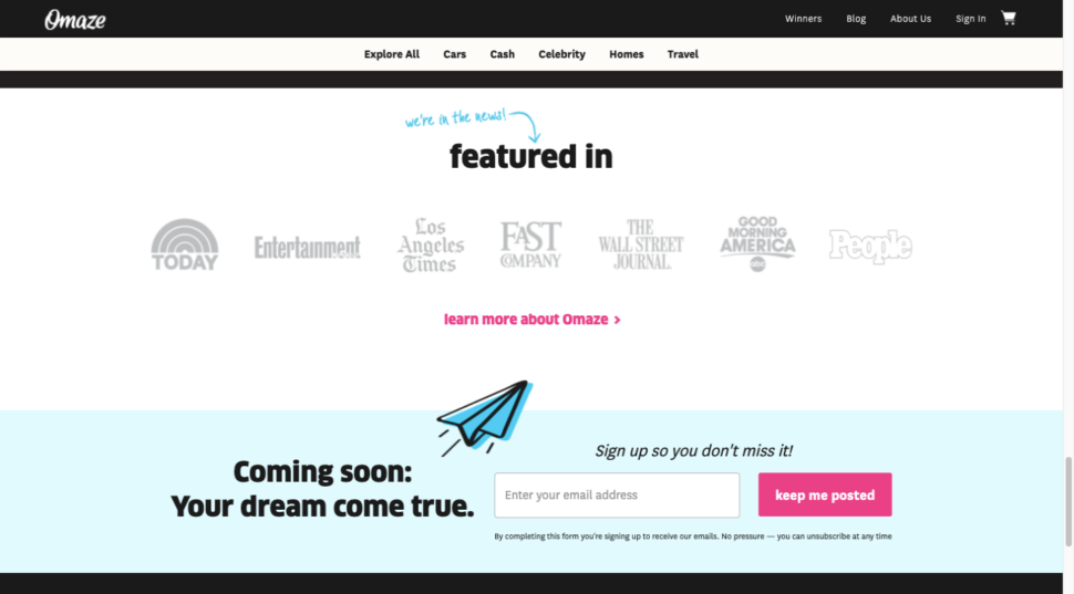
Photo: Web Design Ledger
Testimonials and data visualization are two additional trust building elements that Omaze puts to good use.
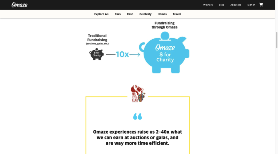
Photo: Web Design Ledger
No matter how large or small the organization or enterprise you’re designing a website for may be, there’s always room for incorporating one or more impressive trust builders.
BePortfolio shows how you might incorporate trust builders in a portfolio site:
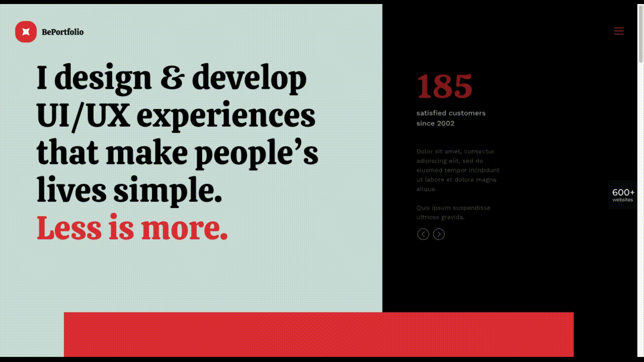
Photo: Web Design Ledger
BePortfolio’s home page dedicates plenty of space to the following trust builders:
- Portfolio samples
- Satisfied customer counts
- Testimonials and case studies
- Client logos
Giving people a reason to trust your brand is fine, but it’s a lot better if you can give them more than enough reasons to do so.
Have you begun to use these new web design trends yet?
As we noted earlier, some trends stay with us a long time. The lifetime of others can be dictated by external events, as can be the emergence of new events such as those discussed in this article. 2020 changed the way we looked at certain things, and 2021 is changing the way we look at things again as we begin to define and understand the new normal.
Whether you want to bring existing sites up to 2021 standards or implement these new trends in your new designs, BeTheme’s 600+ pre-built websites are guaranteed to get you started in the right direction.
Originally posted on Web Design Ledger.